This post contains affiliate links. We may earn a small commission if you purchase through our links, at no extra cost to you.
The paint color decision in a small bedroom is one of the more consequential choices you can make in a home, because the stakes of getting it wrong are real. Repainting costs time, money, and about a week of sleeping in a room that smells like low-VOC regret. I know this from personal experience. I painted a feature wall the wrong terracotta and had to go over it ten days later because it looked burnt under my specific lighting.
So before you commit to anything, here is exactly what color makes a small bedroom look bigger and why each choice works the way it does. Not just color names, but the actual mechanism behind each one so you can apply the logic to your specific room, your specific light, and your specific walls.
And if you are not in a position to paint at all, whether you rent or just cannot face the commitment right now, the full guide on how to decorate a 10×10 bedroom covers every other lever you can pull to make a small bedroom feel larger without touching the walls. The two guides work well read together.
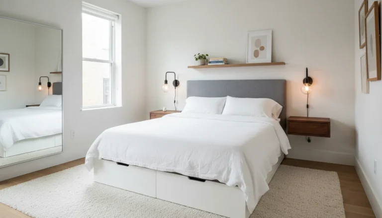
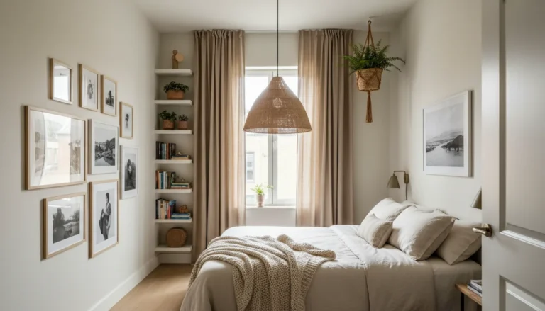
1. Soft White — Not Bright White
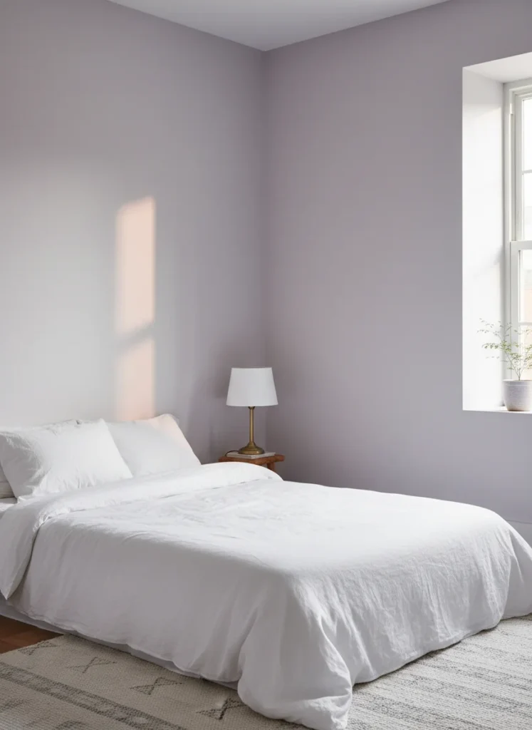
Here is the distinction that trips most people up. Bright white, the kind with a cool blue undertone, makes a small bedroom feel clinical and flat. It reflects light in a way that exposes every imperfection in the wall and makes the room feel less like a sanctuary and more like an empty cube.
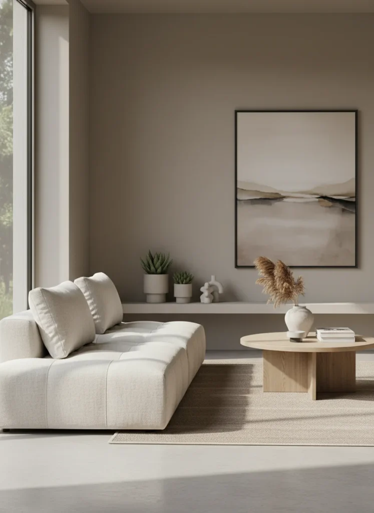
Soft white, specifically a warm cream-white with yellow or pink undertones, does something completely different. It reflects light while adding warmth, which makes the room feel airy without the harshness. Think Benjamin Moore White Dove, Sherwin-Williams Alabaster, or Farrow and Ball All White. These are not the same as the bright white on your rental walls. The undertone is everything.
In a small bedroom that gets decent natural light, soft white is the most reliable choice for making the space feel open and generous without sacrificing warmth. It is also the most forgiving backdrop for any accent color you bring in through bedding, curtains, or a single statement piece. Before committing, test it with a large removable paint sample swatch at around $6 to $8 each. Apply it to the wall and look at it over three days in different lighting conditions before you open a gallon.
2. Warm Greige
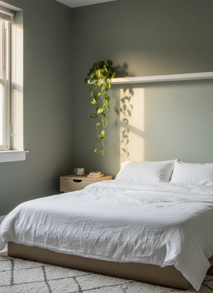
Greige sits at the intersection of grey and beige and it solves a specific problem: the person who wants a neutral room that does not feel completely colorless. Pure grey reads cold in low light. Pure beige can read dated. Greige combines the sophistication of grey with the warmth of beige and in a small bedroom it functions as a neutral that has something to say.
The warm greige tones that work best in small bedrooms are the ones with more beige than grey in the mix. Sherwin-Williams Accessible Beige, Benjamin Moore Pale Oak, and Behr Sculptor Clay are reliable starting points. They pair with sage green, terracotta, and cream accents in a way that feels cohesive without requiring much styling effort.
Greige is the answer when someone says they want a neutral but the all-white option feels too stark and the colored options feel too risky. It is the confident middle ground that photographs well, holds its warmth across lighting conditions, and makes a small bedroom feel settled and intentional rather than empty or unfinished.
3. Muted Sage Green
Sage green is on every small bedroom inspiration board right now and the reason is not trend momentum. It is that muted sage genuinely works at a perceptual level. Green sits at the center of the visible light spectrum, which means the human eye processes it with less effort than colors at either end. In a small space, less visual effort reads as more visual space.
The critical qualifier is muted. Not Kelly green, not mint, not the bright sage of a 1970s bathroom. The sage that works in a small bedroom is the grey-green, the one that looks like it has a small amount of stone dust mixed in. Sherwin-Williams Eucalyptus, Benjamin Moore Pale Sage, and Farrow and Ball Mizzle are the versions that consistently make small bedrooms look larger rather than smaller.
Sage also has an unusual quality with natural light: it changes character throughout the day. In morning light it reads slightly blue-green and cool. In afternoon sun it warms to an almost earthy tone. In evening lamp light it deepens to something close to forest green. That responsiveness to light makes a small bedroom feel more dynamic than a static neutral ever achieves. Test it with a large peel-and-stick paint tester before committing.
4. Dusty Blue
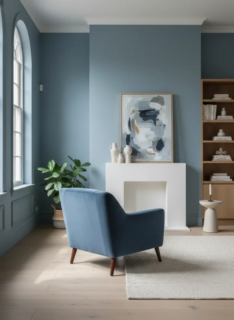
Blue recedes on walls. That is not interior design opinion, it is how the brain processes color temperature. Cool colors appear to move away from the viewer, warm colors appear to advance toward them. In a small bedroom, a wall color that appears to recede visually expands the room.
The version of blue that works is dusty rather than saturated. A muted, slightly grey-toned blue like Sherwin-Williams Mineral Effect, Benjamin Moore Buxton Blue, or Farrow and Ball Lulworth Blue. These are blues that have had some of the loudness taken out of them, which makes them calming in a bedroom context rather than stimulating. Bright or saturated blues in a small bedroom feel like sleeping inside a swimming pool.
Dusty blue pairs particularly well with warm wood tones and terracotta accents, which prevent the room from feeling cold. A sage green plant, a warm brass lamp, and cream bedding against a dusty blue wall is one of the most reliably beautiful small bedroom color combinations available and it works in almost any light condition.
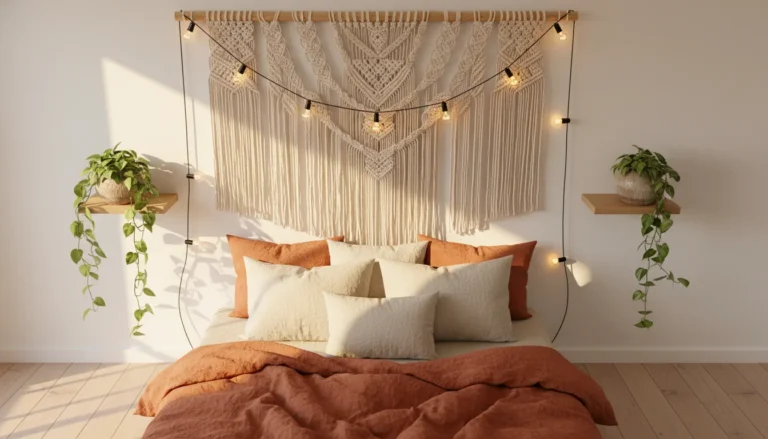
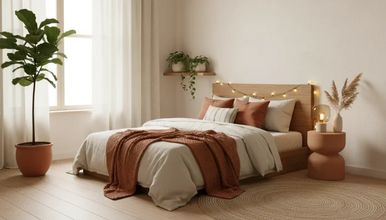
5. Terracotta — One Wall Only
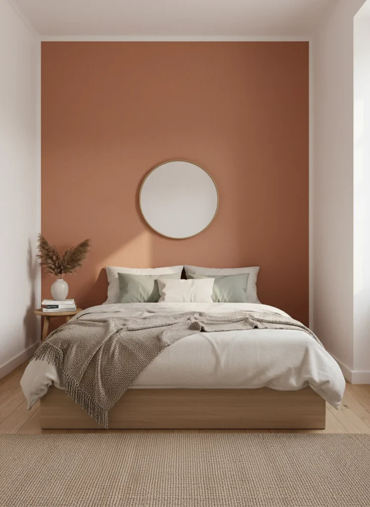
Terracotta is my personal signature color. I have used it in every apartment I have decorated for four years and it consistently delivers warmth, personality, and depth that no neutral can replicate. In a small bedroom it requires one significant constraint: one wall only.
All four walls in terracotta in a small room will feel like being inside a pot. The color advances toward the viewer, which is beautiful when it is doing so from one accent wall and suffocating when it is doing so from all four directions simultaneously. The headboard wall as a single terracotta feature, with the remaining three walls in soft white, creates exactly the right effect: warmth and depth from one direction, openness and airiness from the other three.
For renters who cannot paint, a terracotta peel-and-stick wallpaper panel on the headboard wall achieves the same visual result. For owners who can commit, Sherwin-Williams Cavern Clay, Benjamin Moore Promenade, and Clare Spice are the terracotta shades that hold their warmth across different lighting conditions without shifting toward orange. The distinction between good terracotta and bad terracotta is almost entirely in the undertone: warm red-brown good, bright orange bad.
6. Pale Lavender
Pale lavender occupies a unique position in the small bedroom color palette because it sits in the middle ground between cool and warm. It reads as feminine without being pink, calming without being cold, and it has a quality in morning light that very few other colors can replicate: it becomes almost luminous when direct sunlight hits it, appearing to glow from within rather than simply reflect.
In a small bedroom with an east-facing window, pale lavender is one of the most spectacular morning light colors available. Benjamin Moore Violet Mist, Sherwin-Williams Dreamy White with lavender undertones, and Farrow and Ball Brassica diluted significantly are the starting points worth testing.
The styling note: pair lavender walls with warm wood tones rather than cool grey or white accessories. Warm wood, cream linen, and a brass or gold lamp against pale lavender walls produces a room that feels expensive and considered. The same lavender walls with silver and white accessories feels sterile and slightly clinical. The warmth of the accessories is what makes the cool lavender wall feel inviting rather than distant.
7. Soft Charcoal — One Wall Only
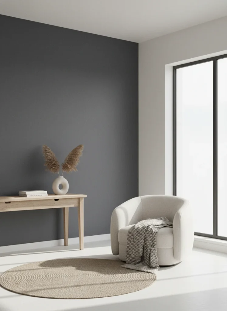
A dark wall in a small bedroom sounds like exactly the wrong answer. Here is the thing: a single dark wall in a small bedroom does something that no light color can do. It creates the illusion of depth. The wall appears to recede, which makes the room feel three-dimensional rather than flat. One dark wall in a room of four light walls is not smaller than four light walls. It is more interesting, and interesting reads as larger.
The specific version that works: a soft charcoal with warm undertones rather than blue undertones. Farrow and Ball Mole’s Breath, Sherwin-Williams Peppercorn, and Benjamin Moore Kendall Charcoal all have enough brown-warmth in their base to avoid the cold, industrial quality that pure grey generates. Apply to the headboard wall only. Leave the other three walls in soft white or warm greige. The contrast between the dark accent wall and the lighter walls creates exactly the depth effect that makes the room feel larger.
Non-negotiable requirement: warm lighting. A soft charcoal wall under cool white LED light looks institutional. The same wall under a 2700K warm lamp looks like a boutique hotel room. The light source determines whether dark accent walls look deliberate or depressing.
8. Butter Yellow
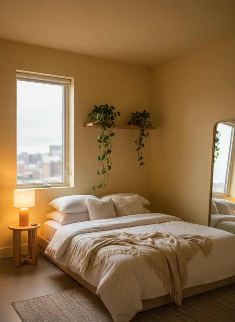
Butter yellow has one specific superpower in bedroom contexts: it acts as a substitute for natural light. In a north-facing bedroom, or any bedroom with limited window space, the walls receive little to no direct sun and can feel perpetually dim regardless of how many lamps you add. Butter yellow walls change that equation because the warm yellow tone reads as sunlit even when it is not.
The distinction between butter yellow and regular yellow matters here. Regular yellow is saturated, stimulating, and demands attention. Butter yellow is soft, warm, and inviting. It looks like cream that decided to have a little more personality. Benjamin Moore Pale Moon, Sherwin-Williams Honeybee, and Farrow and Ball Dayroom Yellow are the versions that stay in the warm-but-quiet range rather than tipping into the loud-statement zone.
If your bedroom is north-facing, has one small window, or simply never feels bright enough no matter what you do with the lighting, butter yellow walls can make a bigger difference than any lamp purchase or mirror placement. This soft, warm shade reflects available light in a way that makes small rooms feel noticeably brighter, warmer, and more open without looking harsh or overly saturated. It is one of the most effective paint colors for light-challenged bedrooms because it adds warmth while still keeping the space airy.
For more ways to visually expand a compact bedroom using paint, contrast, and layout choices, explore the full guide to bold color small bedroom ideas.
9. Limewash White
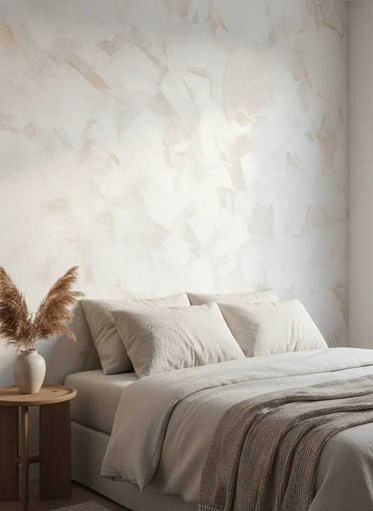
Limewash is a technique rather than just a color, and it solves the problem of the person who wants more than a flat painted wall but cannot commit to an actual color. Limewash paint applied over white or off-white creates a textured, organic, layered effect where the tone shifts across the surface, lighter in some areas, slightly warmer in others, with a quality that no single flat color can replicate.
In a small bedroom, the texture that limewash creates adds the visual depth that makes a room feel three-dimensional. Flat paint in any color reads as one surface. Limewash reads as a surface with history, which the eye processes as more complex and therefore more spacious. It is the option for someone who wants the room to feel interesting without committing to a saturated color that might not age well with changing tastes.
Portola Paints Roman Clay, LIME-IT by Bauwerk, and Romabio Classico Limewash are the most reliable products currently available for a DIY application. The technique requires two coats applied with a wide brush in overlapping strokes rather than a roller, which is part of what creates the variation. Budget an afternoon and a second coat the following day. The result looks like something a professional charged significantly more to produce.
How to Test Any of These Colors Before You Commit
The single most expensive mistake in bedroom paint decisions is choosing a color from a phone screen and opening a gallon. Every color on this list will look different in your specific room depending on your ceiling height, your window size, your window orientation, and the light bulbs you have installed. The color that looks exactly right on someone else’s bedroom wall can look completely wrong in yours.
The testing method that has saved me real money: order large removable peel-and-stick paint sample swatches at around $6 to $8 each. They are 12-by-12-inch panels you stick directly to the wall, look at for three to five days across all lighting conditions, and then peel off without leaving a mark. Test at least two colors side by side. Look at them in morning light, afternoon light, and with your specific lamps on in the evening. The color that looks best across all three conditions is the one to buy a gallon of.
And if you are not ready to paint at all yet, every color on this list can be introduced at a smaller scale first: through bedding, through a large art print, through curtains. Live with the color in textile form for a month before committing it to the walls. By that point you will know with genuine certainty whether it is the right choice for your room or not.
Which color on this list are you most seriously considering? Drop it in the comments along with your room’s window situation, north-facing, south-facing, one small window, and I can give you a specific opinion on whether it will work the way you are hoping.