This post contains affiliate links. We may earn a small commission if you purchase through our links, at no extra cost to you.
Color is the whole game in dopamine decorating. Get the palette right and everything else falls into place around it. Get it wrong and even a well-styled room feels off in a way that is hard to name but impossible to ignore.
The 2026 dopamine decorating color palette has shifted away from the bright primary saturations of a few years ago toward something richer and more considered. The colors dominating this aesthetic right now are warm, earthy, and deeply saturated without being aggressive. They work particularly well in small spaces because they create intimacy rather than volume.
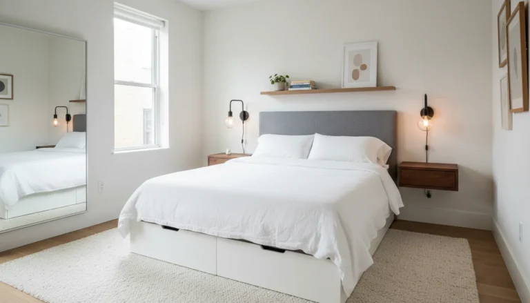
Before getting into the specific colors, a quick note on how to use this guide: it connects directly to the full dopamine decorating for small spaces approach, the dopamine decorating bedroom ideas that show how these colors land in a bedroom specifically, and the dopamine decorating living room ideas where color choices land differently when the room is shared. Reading those alongside this color guide gives you the complete picture.
The 2026 Dopamine Decorating Color Palette: The Four Anchor Colors
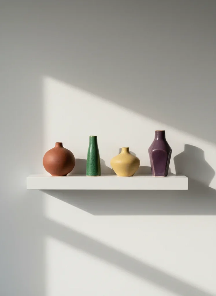
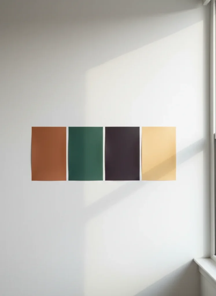
The four colors that define the 2026 dopamine decorating palette are terracotta, jade green, plum noir, and butter yellow. They share three qualities: they are all warm-toned at their base, they all appear to change slightly in different lighting conditions, and they all hold their own without needing a loud room to support them.
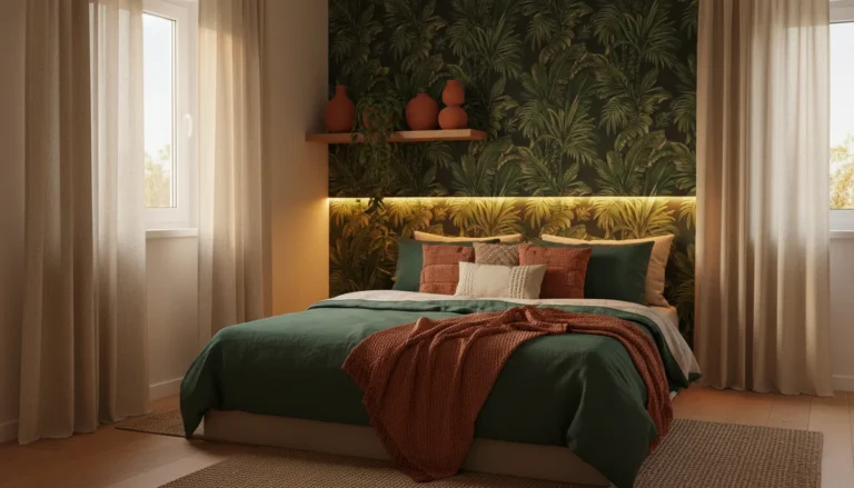
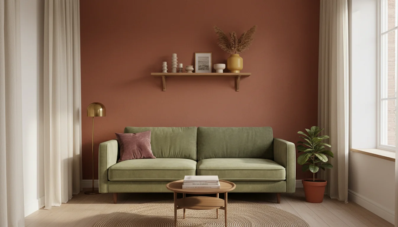
Terracotta is the anchor of the 2026 palette and has been for two years now. It reads as warm, grounded, and personal in a way that most bold colors do not. It works in every room, with almost every complementary color, in almost every lighting condition. If you are choosing one color to lead your dopamine decorating journey, terracotta is the most forgiving entry point available.
Jade green is the complementary pairing that makes terracotta come alive. The warm orange-red of terracotta and the cool blue-green of jade sit across from each other on the color wheel, which means they create natural tension and visual energy when used together. Not conflict, tension. There is a difference. Tension is what makes a room feel designed. Conflict is what makes it feel wrong.
How to Use Plum Noir in the Dopamine Decorating Color Palette
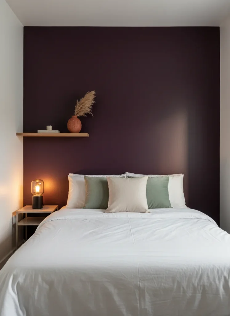
Plum noir is the darkest color in the 2026 palette and the one most people hesitate on. It is a deep, warm purple-black that sits closer to eggplant than to grape. In a small room, it creates cocoon-like intimacy when used on an accent wall and paired with warm lighting. It does not make the room feel smaller. It makes it feel intentional.
The critical rule with plum noir: warm lighting is non-negotiable. Cool white LED light on a plum wall looks institutional. The same plum wall under a 2700K warm lamp looks like a boutique hotel room. The color is not the variable. The light is. Always choose your light source before committing to a wall color.
For a renter who cannot paint, plum-toned removable wallpaper around $35 to $48 achieves the same depth effect on a single accent wall. The tactile quality of the paper surface actually enhances the color in the same way that a matte paint finish does, by absorbing rather than reflecting light.
Butter Yellow: The 2026 Dopamine Decorating Color Palette’s Lightest Move
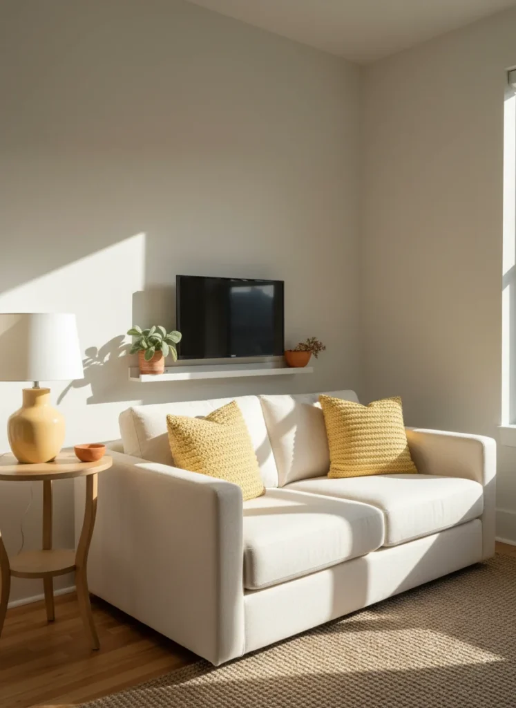
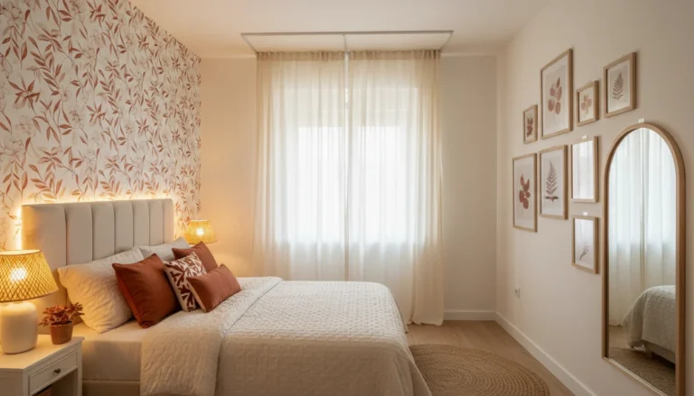
Butter yellow is the gentlest entry point in the 2026 dopamine decorating color palette. It is warm without being aggressive, bright without being harsh, and it has an almost unique quality of making a room feel sunlit even when the actual light is limited. For north-facing apartments or rooms with small windows, butter yellow accents do the work that natural light cannot.
Unlike terracotta and plum, butter yellow works best as an accent rather than a dominant color in a small room. Two yellow throw pillows on a cream sofa, a yellow ceramic lamp on a side table, a butter yellow duvet layered under a white duvet cover: these applications introduce the color as warmth rather than statement. It supports the bolder colors in the palette rather than competing with them.
A butter yellow ceramic table lamp at around $32 is genuinely one of the simplest ways to introduce this color at a functional level. You get the color in the object during the day and a warm glow from the bulb that reinforces the palette after dark. One purchase, two effects.
How to Combine the Dopamine Decorating Color Palette Without It Looking Chaotic
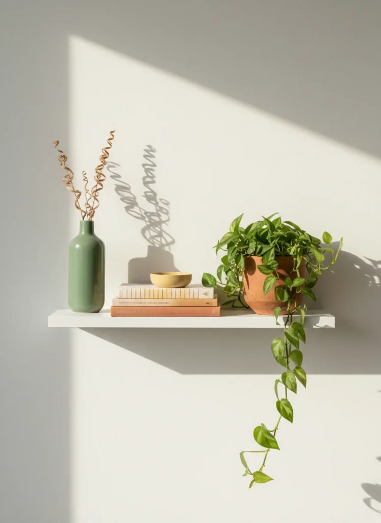
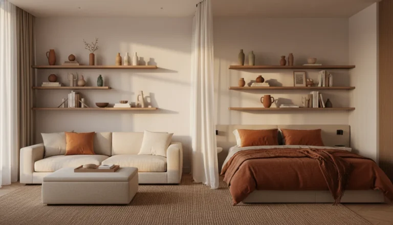
The rule that prevents the 2026 dopamine decorating color palette from looking chaotic rather than joyful is this: choose one dominant color, one complementary color, and one neutral. The dominant color covers the largest surface, usually the bedding, a rug, or an accent wall. The complementary color appears in accents, pillows, vases, and small objects. The neutral, cream, warm white, or natural linen, gives the eye somewhere to rest between the two bolder choices.
Terracotta dominant, jade green complementary, cream neutral is the combination I keep returning to in my own apartment because it is warm enough to feel cozy and varied enough to feel considered. Plum noir dominant, butter yellow complementary, cream neutral is a more dramatic version of the same logic. Both combinations work. The key is committing to the structure rather than adding colors reactively as you shop.
A terracotta and sage green pillow cover set at around $22 lets you test the dominant-complementary pairing in fabric before committing to any wall color or large purchase. If the combination works in the pillow form, it will work at any scale you take it to.
Testing Colors Before You Commit to the Dopamine Decorating Color Palette
The most expensive mistake in dopamine decorating is choosing a color from a photograph on your phone and committing to it across an entire room. Colors behave completely differently depending on the light source, the time of day, and what else is in the room. A terracotta that looks rich and warm on Pinterest can look almost orange under certain ceiling lights. A jade green that reads as sophisticated in an editorial can look murky in a north-facing room with no direct sun.
Before painting a wall or buying a large bedding set, use large removable paint sample swatches at around $15 for a set. Apply them to the actual wall you are considering and look at them at different times of day, morning light, afternoon light, and with your evening lamp on. The color that looks best across all three lighting conditions is the one to commit to.
I learned this from repainting a feature wall in my apartment because I chose the color from a phone screen at 9pm. It looked completely wrong by daylight. The repainting cost more time and money than the original paint. The $15 swatch test would have saved both.
The Colors That Do Not Work in Small Dopamine Decorating Spaces
Bright primary colors, pure red, cobalt blue, electric yellow, tend to work against dopamine decorating in small spaces because they carry too much visual energy for the room to hold. They are stimulating rather than joyful, which is the opposite of what the aesthetic is trying to achieve. The 2026 palette is rich and saturated but always warm and slightly muted at the base tone. That quality is what makes the colors feel cozy rather than overwhelming.
Cool colors in general, the grey-blues, the sage greens that lean grey rather than earthy, and pure white as a dominant surface, all flatten the warmth that dopamine decorating depends on. They look beautiful in other design contexts. In the 2026 dopamine decorating palette they work against the visual temperature the aesthetic requires.
Which of these four colors feels most like you? Terracotta, jade, plum, or butter yellow? I am always curious what people gravitate toward before they have decorated with it yet.